HDC Discover enables users to analyze and compare data across multiple sources, offering valuable insights for discussion. Users can compare their data with their peers, create custom groups, and view group aggregates across specific measures, at different levels of aggregation, whether it’s a specific division, a local health area, a health authority (HA), or the entire province.
To support these needs, the QI Panel in HDC Discover allows users to view data from up to eight (8) data sources simultaneously for a high-level overview across various measures. For a more in-depth analysis of a single measure, the Single Measure View (SMV) supports comparisons across fifteen 15 data sources. Users also can export graphs and data for further exploration.
Let’s walk through an example where a user wants to review their own practice prevalence of hypertension measure in relation to their immediate community and geography:
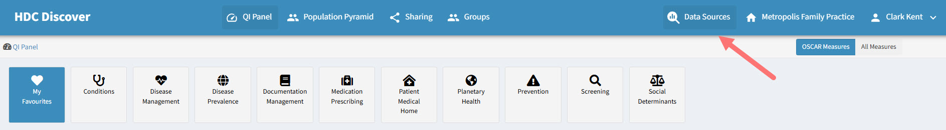
- Select Data Sources
Click on the Data Sources option on the navigation menu.
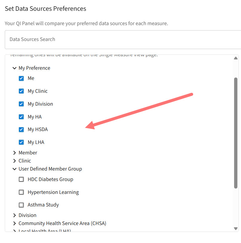
- Choose My Preference
Under the Data Source List, locate the My Preference List, where your practice data contributes to the relevant regional hierarchy. Select all the available data sources under it. Additionally, you may choose any other data sources of interest from the available options.
- Review My Sources
As you select, you’ll see these sources appear under My Sources. Once you’ve added eight (8), a message will appear indicating that the QI Panel displays up to eight (8) sources, while any additional ones will be available in the Single Measure View (SMV).
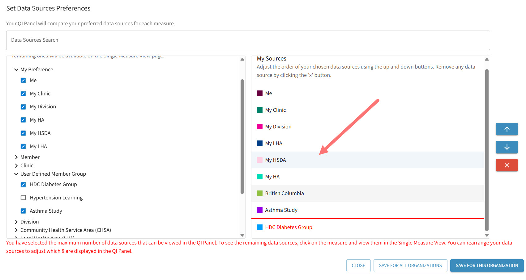
- Prioritize and Save
After selecting all your desired data sources, prioritize them based on your interest using the up and down arrow buttons on the right side. Then click Save for this Organization. Click here to learn more about data sources. - View in QI Panel
You’ll now see data for the selected eight (8) sources displayed across all measures on your QI Panel.
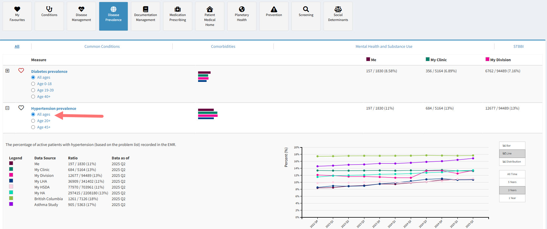
- Drill into Hypertension Prevalence
Click on the Hypertension Prevalence measure under the Disease Prevalence domain to enter the Single Measure View. Here, you’ll be able to compare data across all selected data sources.
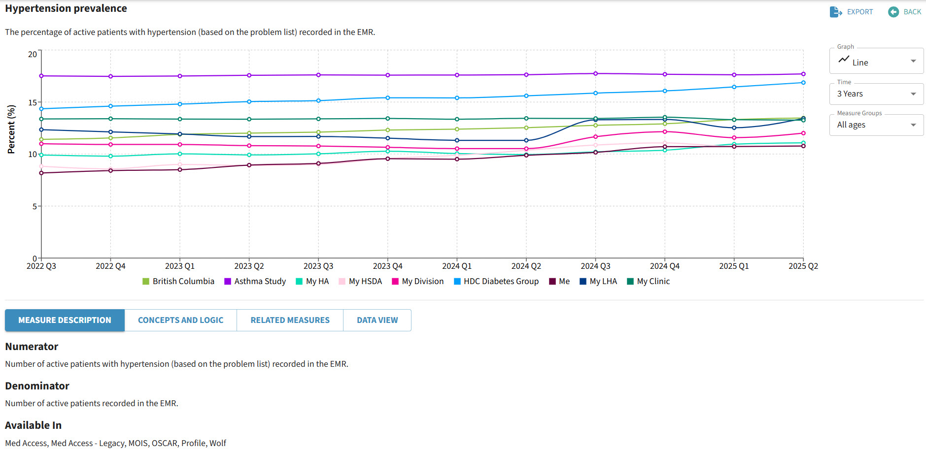
- Explore the Measure
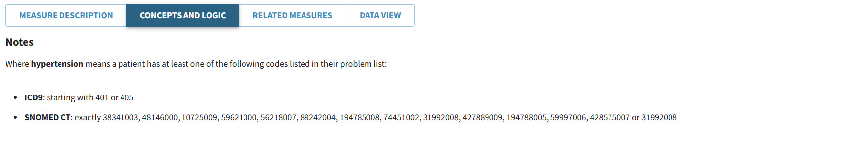
Use the Tabs below the graph to learn more about the measure. You can also change the graph type using the dropdown menu on the right.
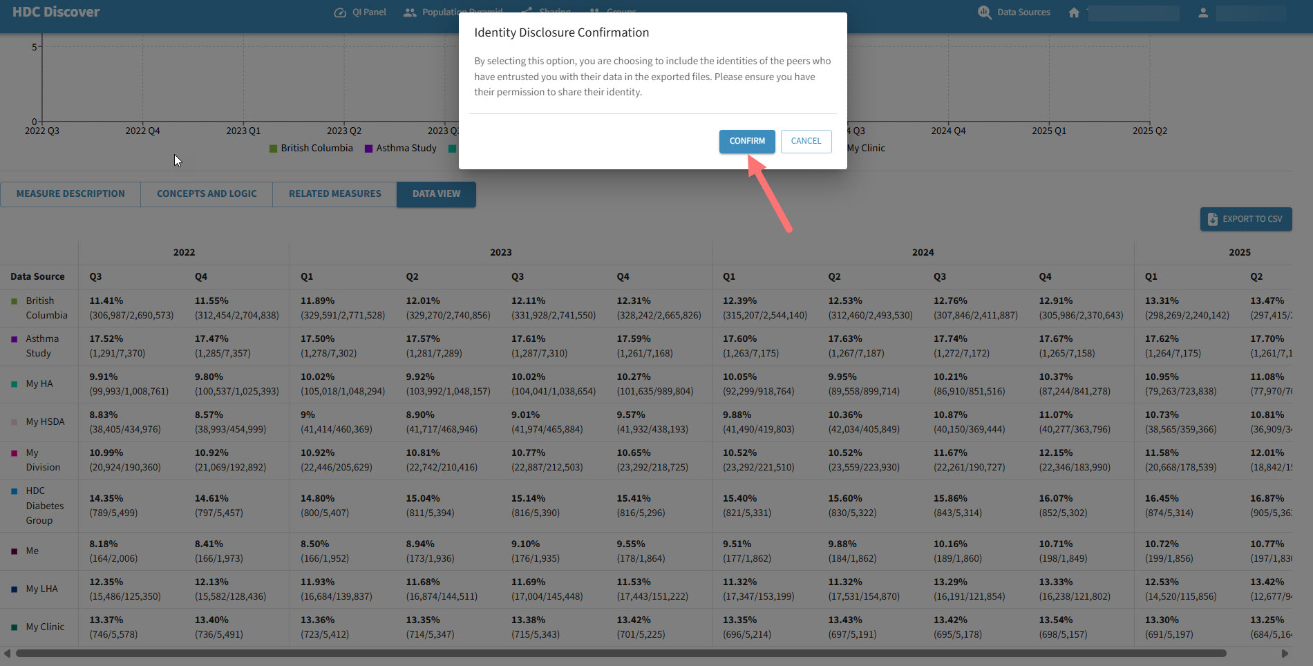
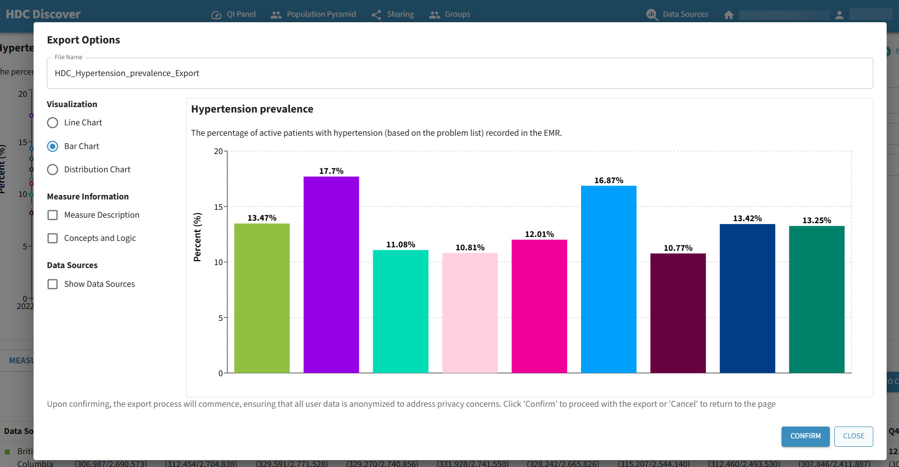
- Export Options
-
- To export the graph, click the Export button and follow the prompts. Click here to learn more on how to export as ease.
- To export the data behind the graph, go to the Data View tab and click Export to CSV. Click here to learn more about data export.