The distribution chart just got a powerful upgrade! Previously, the chart displayed data across all registered clinics by default. Now, it adapts based on selected data sources—like Division, HA, or other aggregates—showing clinics anonymously and specifically under the chosen aggregate data source.
Let’s dig into how this upgrade can help you analyze data more effectively.
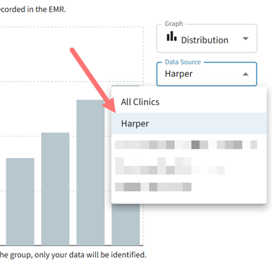
Imagine you belong to the Harper Division of Family Practice and want to explore what sort of demand exists in clinics in your division for Anxiety and Phobia comorbidities. Here’s how you can use the upgraded distribution chart:
Steps to Use the Distribution Chart
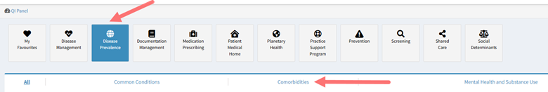
1. Navigate to the QI Panel:
- Select the Disease Prevalence Domain and then the Comorbidities Subdomain.
 2. Find the Measure:
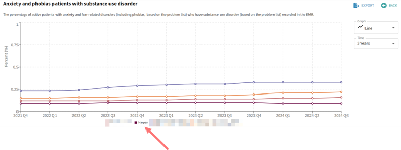
- Look for the Anxiety and phobias patients with substance use disorder measure or click here to access it directly.
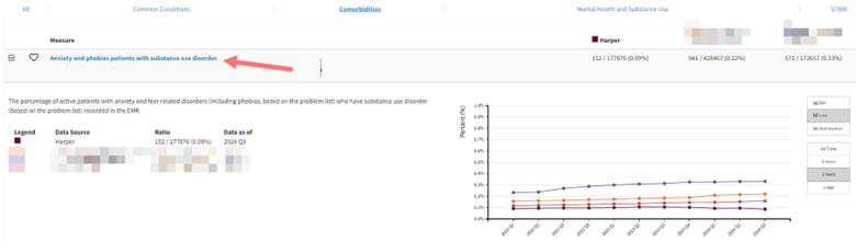
3. Check Your Data Sources:
- Confirm that your division is selected as a data source.
- If unsure how to prioritize or select data sources, click here to learn more
4. Access the Distribution Chart:
- Under the Graph options, select Distribution Chart.
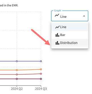
5. Filter by Data Source:
- Use the new Data Source dropdown to select a data source containing aggregate data of interest, like your division.
6. Analyze Clinic Data:
- View aggregate data for all clinics within your division.
- Hover over each clinic’s data point to see detailed information.
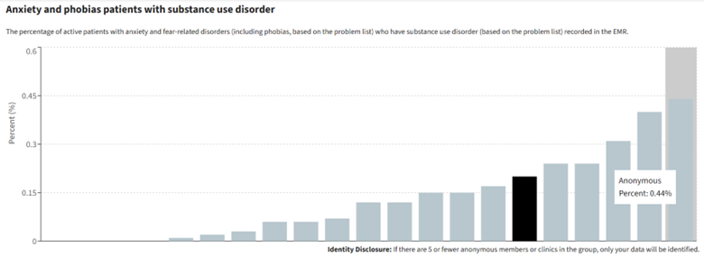
Note: If a clinic name appears as anonymous, it means you don’t have sharing consent with that clinic. Learn more about our sharing feature here.
Distribution charts with identifiable organizations open the door for meaningful conversations within groups. Users can discuss clinic-specific activities or best practices or other factors that may be contributing to variations in responses. This transparency fosters collaboration and sets the stage for collective improvement to occur.
Start using the upgraded distribution chart to gain actionable insights tailored to your aggregate data sources!