Skip to content

We’re excited to showcase the new dashboard for all HDC Discover users! The dashboard provides a clear, high-level snapshot of your individual panel or clinic group practice, making it easier than ever to explore your data and discover opportunities for review.

Let’s take a quick tour of what’s new, plus some tips and tricks to help you make the most of it.

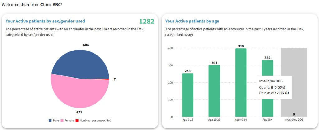
Panel Distribution by sex/gender used and age

    What you’ll see: A new visual chart breaks down your active patients (those with an active status and with an encounter in the past 3 years) by age and sex/gender.

    • Tips and Tricks:
      • The total active patient count now appears directly on the grid, no more guessing!
      • Hover over any section to see quick stats like count and percentage of your total panel along with when the data was last loaded.
      • Click any segment to jump straight to the Single Measure View page for a deeper insight.
      • Use this insight to understand the population segments of your panel.

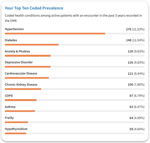
    Top 10 Coded Prevalence

    What you’ll see: A ranked list of the most frequently coded conditions in your panel or clinic.

    • Tips & Tricks:
      • Click any condition to open the Single Measure View, where you can compare your data to peer and regional averages.
      • Use this section to spot patterns or emerging trends of conditions within your practice population.

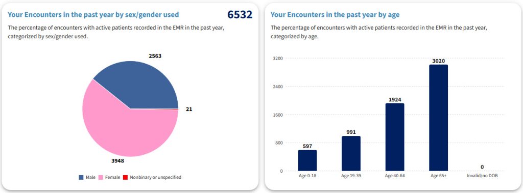
    Encounter Distribution by sex/gender used and age

    What you’ll see: A similar chart to the panel demographic distribution but focused on encounters over the past year, providing a current reflection of your practice activity in terms of gender or age.

    Tips & Tricks

    • For personal views, you’ll see the percentage of encounters where you are the primary provider.
    • For clinic-level views, the dashboard displays the percentage of active patients with at least one encounter who have an assigned MRP (Most Responsible Provider).
    • Compare this with your panel distribution to spot differences between who’s on your panel and who you are seeing most often.

    Where to Look Next

    What you’ll see: A new set of navigation buttons that help you explore key areas of your practice, including screening and prescribing habits, documentation practices, and condition-focused measures.

    • Tips and Tricks:
      • Think of these buttons as shortcuts to different domains within your QI Panel.
      • Try exploring one new area each week to continuously uncover insights and improvement opportunities.