New to stacked bar charts? Click here. Already familiar and want to know more, keep reading.
The Stacked Bar Chart provides a clear visual representation of how individual segments contribute to a whole.
It helps users quickly interpret data distribution and proportion, making it easier to compare segments while still understanding their relationship to the total. This is also very effective when comparing across different data sources.
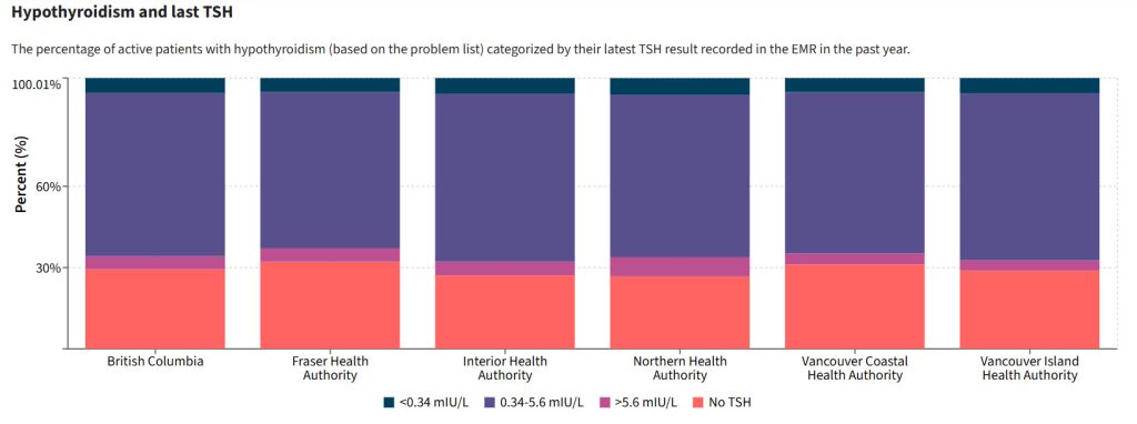
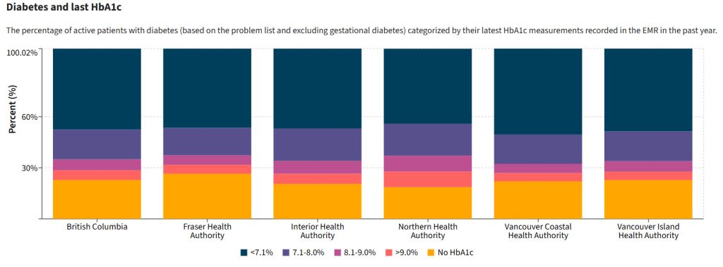
In examining TSH lab results for people being treated for hypothyroidism, or checking HbA1c results for patients managing their diabetes, this chart type provides a quick overview.
The Stacked Bar Chart option appears only when the values of a measure add up to 100%.
This ensures that each segment in the chart represents a proportion of the total, giving you an accurate, meaningful visual of how your data is distributed.
Why Don’t all Measures Show a Stacked Bar?
Let’s take the Asthma Prevalence measure as an example. This measure provides prevalence data for several age groups:
- All Ages
- 0–5
- 6–11
- 12–17
- 18+
- 65+
At first glance, it might seem like a stacked bar would be a suitable visualization option but, in this case, the age groups overlap.
For example, the 18+ group also includes the 65+ population, and the All Ages category covers all groups combined.
Because of this overlap, the data does not sum to 100%, and therefore, a stacked bar visualization would be misleading.
In contrast, measures like Diabetes and last HbA1c displays distinct, non-overlapping categories, such as specific HbA1c result ranges.
Since these categories are mutually exclusive and their values sums to 100%, the Stacked Bar Chart becomes an available and meaningful visualization option.