Version 3.14 was released to production on August 12th 2025. Please do not hesitate to contact our support email support@hdcbc.ca should you have any questions or comments about any of these changes.
What’s New?
New Dashboard Experience
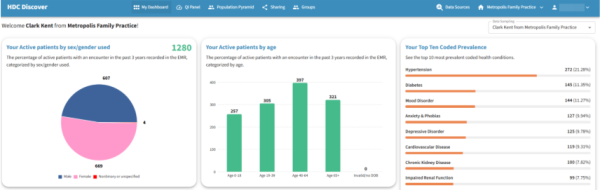
We have introduced a fresh new landing page for all Clinic users logging into the Discover app. This new experience provides users with a high-level summary of their individual or clinic panel and practice, before guiding them to the QI Panel to access more measures.
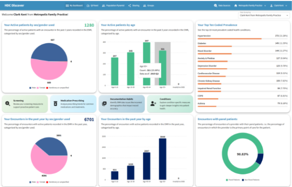
Key Insights Include:
- Panel Distribution by Age and Sex/Gender: This new visual component provides insights into the distribution of active patients with an encounter in the past 3 years broken down by age and sex/gender used. This allows for better understanding of population makeup across a user’s panel.
- Users can now view their total active patient count directly on the grid.
- Hovering over the graph displays quick statistics such as count and percentage of panel size.
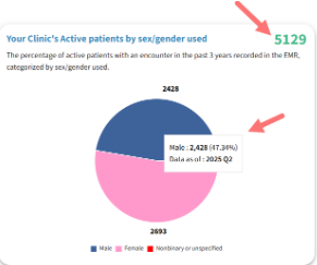
- Clicking any component of the graph leads directly to the related Single Measure View page for more information.
Top 10 Coded Prevalence: This section presents a snapshot of the most frequently coded conditions in the user’s panel or clinic. Users can click on any condition to access the Single Measure View, where they can compare their data with peers or regional aggregates.
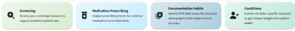
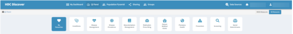
- Where to Look Next: The following new set of buttons guide users toward different areas of exploration, including screening and prescribing habits, documentation practices, and learning more about other conditions. Each button links directly to the relevant domain within the QI Panel.
Encounter Distribution by Age and Sex/Gender: Similar to Panel Distribution mentioned above, users can also quickly view their encounters with active patients distributed by age and sex over the past year for current reflection of their practice.
- When viewing personal data, users will see the percentage of encounters where they serve as the primary provider.
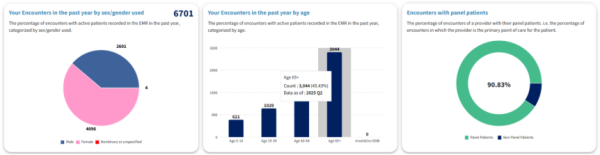
- For clinic-level views, the dashboard displays the percentage of active patients with at least one encounter who have an assigned MRP.
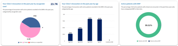
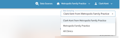
- Users can also toggle between clinic-specific and province-wide data samples for comparison.
Improvements
QI Panel Domain Design
The domains within the QI Panel have been redesigned for enhanced usability and improved visual clarity. The domains within the QI Panel have been visually updated to improve navigation and usability, helping users access the data they need more efficiently.
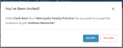
Enhanced Clinic Invitation Workflow
To enhance visibility and improve user control over clinic associations, a new notification icon will appear in the navigation menu when a user receives an invite to join a clinic.
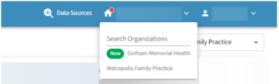
The new icon will allow our users to quickly view thew new invite under the clinic dropdown option and accept or decline the invite with a single click.
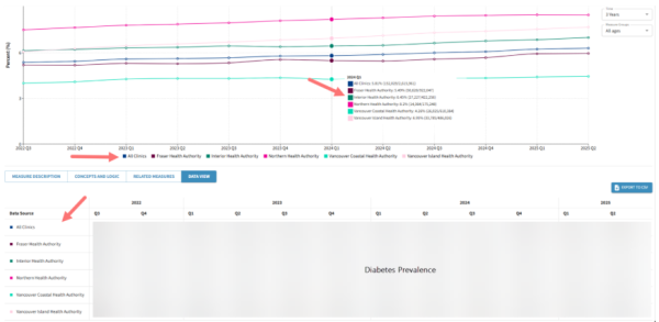
Single Measure View Updates
The Data View tab now reflects the prioritization of data sources defined by the user in the Data Sources modal. The order of data sources shown in tooltips, graph legends, and the data table now aligns with the selection made by the user, offering a more intuitive and personalized data experience.
Note: For more information or questions, please contact support@hdcbc.ca.