Distribution charts provide a great way to get a sense of where your clinic resides amongst the other clinics enrolled in HDC Discover. Practice reflection is a chance to step back from your day-to-day activities, to gain a wholesome view of your primary care practice. One of the unique aspects of the HDC Discover application is that it allows comparisons ACROSS clinics in a safe and anonymous manner. The Distribution chart is an excellent way to get that comparative perspective.
How to Utilize the Distribution Chart within the Single Measure View.
Imagine you are interested in seeing where you fit amongst primary care clinics within your community regarding the active flag setting within your patients’ electronic medical records (EMR).
- Navigate to the QI panel, click on the Documentation Management domain, and look for “Patients with active status who have a visit in the past 3 years.” Click on the measure name to access the Single Measure page.
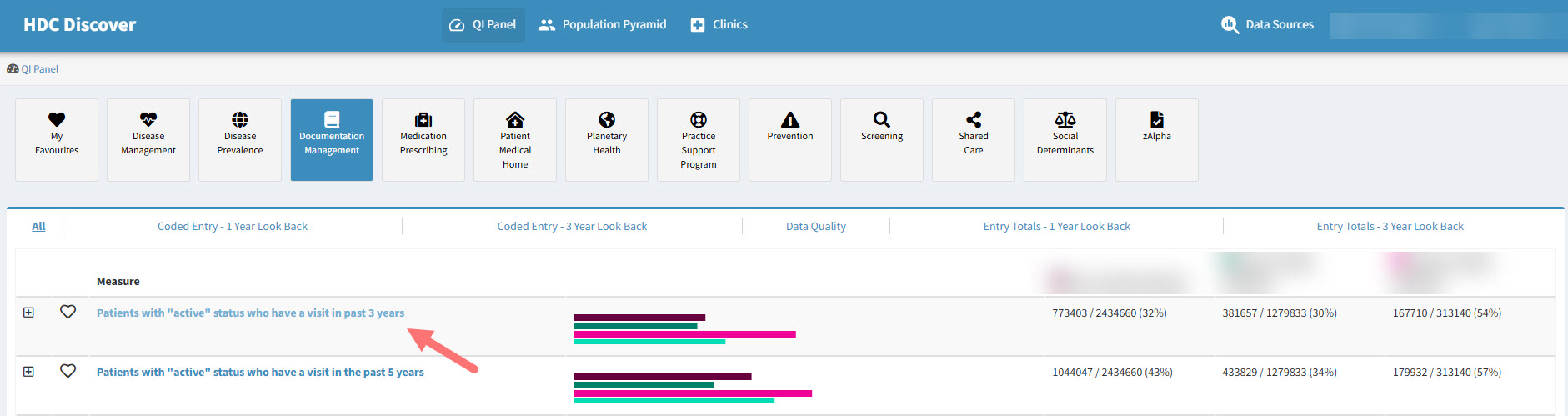
- Confirm your data sources, recalling that when in the single measure view, a user is allowed to choose up to 15 data sources.

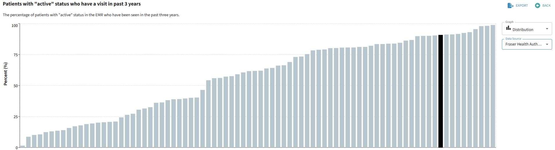
- Navigate to the Graph drop down menu to the right of the chart and select the Distribution graph type.
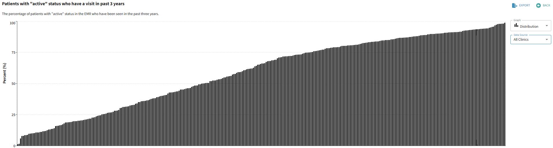
- In this view, each bar in the graph represents a single clinic contributing data to our quality improvement application.
- A user will see their own clinic, highlighted and named in this graph type, with the other clinic bars remaining anonymous.
- If your clinic or you as a member has a share invitation in place, the clinic or individual you are sharing with will also be named and highlighted in this distribution graph type.
Viewing a private group in the Distribution graph type will allow you to see aggregate data from each member of the group, with only those that have consented to share being named, the others remain anonymous.